


Background
Duration:
~3 Months
Software:
Figma, Miro, Photoshop
Elements Designed:
App, Physical
Team Members:
Lydia Goshen
Gaige Dickerson
Daniel Moo Young Kim
My Role:
Project Manager
What I Learned
Noa was my first UX project where I was Project Manager, so I learned how to properly manage a team of people will varying skillsets, schedules, and work methods.
This was also the first project that relied so heavily on AI, and that was one of my biggest tasks in the latter part of the design schedule, figuring out exactly how the system would work in the real world, and how to display that complex information to others.
From visual design and system architecture, to how to work in an agile work environment, Noa arguably taught me more about being an effective UX designer than any other project I've worked on.
Problem/Solution
We receive, on average, over 100 notifications per day. Each one bringing with it the chance of distraction and loss of productivity. Missing out on a notification can cause stress but, interacting with every notification takes forever.
We aimed to create an adaptive system that helps people increase their productivity and focus without impeding on what matters to the user.
Project Overview
Noa is a two-piece artificial intelligence system.
The first piece of Noa is an AI system on the phone that tracks data related to when, where, and how users interact with their notifications, to determine what they find important, and what can be saved for later viewing.
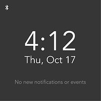
The second piece of Noa is a phone case with a detachable e-ink screen that works as a barrier. This means users can place their phone out of sight, without missing any notifications that would be important.
View the entire process book with the button below.
Value Proposition
Prioritize
Detach
Assist

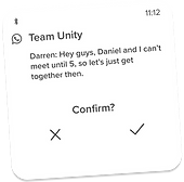
Noa AI determines what notifications the user finds important, along with when and why, so they can be displayed in the best way possible!
To activate "work mode" users have to physically detach Noa from their phone, providing distance and removing possible distractions.
.png)
From AI generated quick replies, list creation, and notification reminders, Noa has many ways to assist their users in staying productive.

Research
My team and I went though several rounds of research, starting with our secondary research, which looked into the causes and effects of receiving a lot of notifications.
Our primary research consisted of:
-
A Survey with 87 responses
-
12 Interviews
-
2 Shadowings of 24 hours each
-
Competitive Analysis of 5 competitors
From here we gathered all of our data, created our personas and user journey maps, and began the affinity mapping process.

Personas


User Journey Maps


Affinitization
From 250+ data points, down to 6 key insights.


1.
Everyone has unique preferences for notification engagement, which includes time received, vocabulary used, length, personalization, and visuals of the notification.
2.
Notifications need to be sensitive to time, organization, and people’s individual priorities without taking over their lives because people are often bothered by notifications, but are often too busy to do something about it.
3.
Notifications that don’t spark immediate attention, bring about emotions, or are necessary to daily life are often turned off or immediately dismissed.
4.
People tend to ignore notifications when they are busy or when the notification creates negative emotions due to unnecessary time or mental energy spent, such as game, shopping, clickbait, and repetitive notifications.
5.
People’s mental models of the different notification types are split between 3 and 5 different categories, typically with communication notifications in their own category.
6.
People enjoy notifications that are personalized and helpful, such as reminders and communications from loved ones.
First Design Iteration


Some User Testing Findings:
A folding screen is unnecessary is confusing. Use a stand.
Be consistent with iconography.
Previous aspect ratio felt odd, too tall. Make it a square.
Phone case design is not visually appealing.


Second Design Iteration


Some More User Testing Findings:
Controlling music from Noa seems counterproductive and unnecessary.
Shouldn't use a dark theme by default. Use a light theme.
Feels like the Noa screen may fall off, even with the magnet strips.
Notification list reads together. Separate notifications more.


Final Design Iteration


List of features:
Magnetic e-ink screen, attaches to case to charge.
AI system learns important notifications, and order them in display.
Quick reply and respond to calls and texts.
List and Schedule display while attached to case.
Minimal display to reduce distractions.
Final Renders


AI Diagrams


Darren Wells
Project Manager


Gaige Dickerson
Interaction Design
Lydia Goshen
Lead Researcher

Daniel M.Y. Kim